1. Brand Fundamentals
Mission
To help customers adopt technology to achieve the best results for their business.
Vision
To be the most recognized and trusted partner in South East Europe (SEE).
Scope of Business
Digitalization consulting, technology adoption, cyber security (audit & implementation), business operations optimization, and compliance.
2. Color Palette & Specifications
Core Palette
#0A192F
RGB: rgb(10, 25, 47)
HSL: hsl(216, 65, 11)
Core brand recognition and corporate identity color.
#FF6B35
RGB: rgb(255, 107, 53)
HSL: hsl(16, 100, 60)
High-presence indicator for call-to-actions and structural highlights.
#64748B
RGB: rgb(100, 116, 139)
HSL: hsl(215, 16, 47)
Supporting layout copy, neutrals, and compliance grids.
Accessibility Audit (WCAG 2.1 Compliance)
Contrast evaluation of color pairings for readability and high contrast on screen displays.
| Color Combination | Contrast Ratio | WCAG Level Status | Design Recommendation |
|---|---|---|---|
| Primary (#0A192F) on White (#FFFFFF) | 17.60:1 | PASS AAA | Suitable for copy text. |
| Primary (#0A192F) on Black (#000000) | 1.19:1 | FAIL | Avoid layering. |
| Accent (#FF6B35) on White (#FFFFFF) | 2.84:1 | FAIL | Avoid layering. |
| Accent (#FF6B35) on Black (#000000) | 7.41:1 | PASS AAA | Suitable for copy text. |
| Primary (#0A192F) + Accent (#FF6B35) Layer | 6.21:1 | PASS AA | High legibility lockup. |
Brand Resemblance & Competitive Overlaps
Delta-E (ΔE) color distance comparison against major global brand assets (ΔE < 5 indicates high visual resemblance).
| Your Hue | Resembling Brand | Brand Color Swatch | Delta-E (ΔE) Distance | Risk Warning | Market Sector |
|---|---|---|---|---|---|
| Accent (#FF6B35) | Microsoft | #F25022 |
9.35 | Medium Risk | Technology |
| Accent (#FF6B35) | Mastercard | #FF5F00 |
15.07 | Low Risk | Finance |
Mathematical Color Harmonies
Alternative color configurations computed mathematically around the primary base #0A192F:
Complementary
#2E200A
Analogous
#0A2B2E / #0D0A2E
Triadic
#2E0A18 / #182E0A
Split-Complementary
#2E0D0A / #2B2E0A
Monochromatic
Shade:#09162ATint:
#213C63Highlight:
#205097
3. Typography & Scale Hierarchy
Core Typography Pairings
Plus Jakarta Sans
Category: Sans-serif
License: Free & Open Source
Source: Google Fonts
Inter
Category: Sans-serif
License: Free & Open Source
Source: Google Fonts
Recommended Alternate Google Fonts Pairings
| Primary Font (Headers) | Secondary Font (Body Copy) | Design Aesthetic | Google Fonts Import Reference |
|---|---|---|---|
| Inter | Inter | Modern Clean & Tech-oriented | Font Link |
| Poppins | Open Sans | Friendly, Geometric & Highly Readable | Font Link |
| Outfit | Plus Jakarta Sans | Premium, Sleek & Minimalist | Font Link |
| Montserrat | Roboto | Bold & Structured | Font Link |
Digital Embed Guidelines
To use these fonts on digital assets and web pages, copy and paste the codes below:
Web-Ready Typographic Scale Hierarchy
Defined typographic sizing rules optimized for standard desktop and responsive mobile layouts. The right-hand column renders using the exact CSS rules:
| Hierarchy Level | Font Face | Target Size | Font Weight | Line Height | Live Preview Example |
|---|---|---|---|---|---|
| H1 (Hero Title) | Plus Jakarta Sans |
3.00rem (48px) | Bold (700) | 1.2 | Hero Title Text |
| H2 (Section Title) | Plus Jakarta Sans |
2.25rem (36px) | Semi-Bold (600) | 1.3 | Section Title |
| H3 (Subsection Title) | Plus Jakarta Sans |
1.75rem (28px) | Medium (500) | 1.35 | Sub Section Title |
| Body (Large Copy) | Inter |
1.125rem (18px) | Regular (400) | 1.5 | This is larger paragraph text copy. |
| Body (Regular Copy) | Inter |
1.00rem (16px) | Regular (400) | 1.6 | This is the regular standard copy text block of body paragraphs. |
| Caption (Small Copy) | Inter |
0.875rem (14px) | Regular (400) | 1.4 | Figure 1.0: Typographic caption description text. |
4. Logo Guidelines & Spacing
Logo Trademark Alerts
Structural Logo Design Direction
Recommended Logo Type: Wordmark (Logotype) or Combination Mark
Design Rationale: At 8 characters, your name is punchy and readable. A customized wordmark or an icon locked up alongside the text is ideal.
Industry Standards: Google, Starbucks, Spotify
Core Design Conceptual Layouts
| Option | Concept Name | Logo Style | Core Visual Focus | Typical Use Case |
|---|---|---|---|---|
| 1 | QUARDICA Symbol Mark | Abstract Emblem | Focuses on metaphors: stability, precision, security, data flow, quartz crystals | Digital icons, app launcher badges |
| 2 | QUARDICA Wordmark | Wordmark (Logotype) | Distinct typographic letterforms | Corporate letterheads, signage |
| 3 | QUARDICA Combination Mark | Combination Mark | Lockup of symbol + wordmark | Packaging, website headers, clothing |
Logo Variations & Target Mediums
1. Background Application Rules
Light Background Version (Positive): Full-color primary logo. Place on white, light grey, or background values under 15% brightness.
Dark Background Version (Reversed): High-contrast white or light tint logo. Place on solid black, dark primary color, or values above 80% brightness.
2. Print vs. Web Material Guidelines
Digital / Web: SVG or PNG. RGB / HEX colors. High PPI resolutions.
Print Materials: EPS or PDF format. CMYK / Pantone spot colors. Vector scaling.
Spacing & Spacing Clear Zones
To maintain visual impact, a clear zone must be preserved around the logo. No other text, icons, or layout lines should penetrate this zone. Below is the visual representation of the 50% margin boundary (labeled as 0.5X where X is the width/height of the mark):
Logo Positioning & Layout Adaptations
Visual demonstrations of how the logo should be aligned in standard application frames:
1. Web Desktop Navigation Layout (Left-Aligned Logo)
2. Mobile Application Header Layout (Centered Logo)
3. Minimum Size Restrictions (Scale Boundary)
Digital Minimum Size: 32px height (Ensure clear legibility on standard screens).
Print Minimum Size: 15mm height (Preserve vector ratios, avoid fine lines fading).
Application Best Practices
DOs
- DO use the reversed white version on dark backgrounds.
- DO maintain the 50% clear zone spacing rule.
- DO scale the logo proportionally to preserve vector ratios.
- DO place the logo on solid or low-contrast backgrounds.
DONTs
- DONT place the full-color logo on dark colors.
- DONT crowd the logo mark with text or other branding elements.
- DONT stretch, squash, or distort the logo dimensions.
- DONT place the logo over busy background images or gradients.
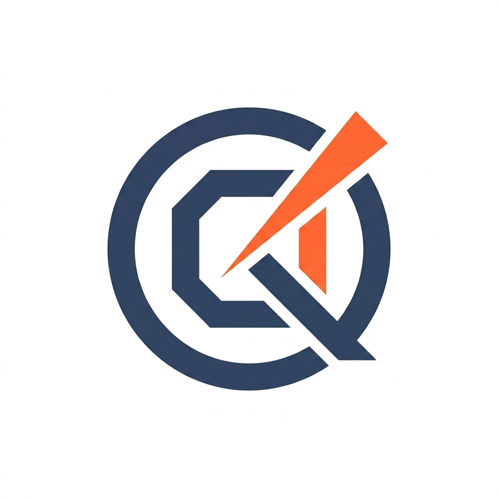
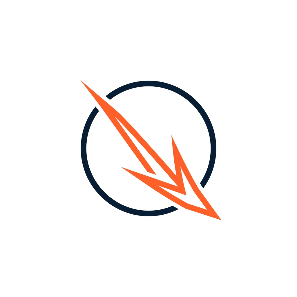
Visual Presentations & Mockup Candidates
Below are the high-resolution generated visual options representing the approved logo tracks:
Option 1: Clean Monogram Q (Restored & Cleaned)
Option 2: Line Art Loop & Chevron Q (Alt B)
Option 3: Sliced Vertex Line Art Q (Alt C)